Portal Customization
Stage is a React-based portal framework with built-in theming and multi-table support. This section covers how to customize the portal's appearance and add additional data exploration pages. These steps are optional, the portal works out of the box with default styling.
Theming
Core Assets
The quickest visual changes:
- Logo: Replace
apps/stage/public/images/navbar-logo.pngwith your organization's logo - Favicon: Replace
apps/stage/public/images/favicon.icowith your browser tab icon
Color Palette
Colors are defined in apps/stage/components/theme/colors.ts as flat palette objects. The key ones to update:
const primary = {
  primary: "#113052", // Main brand color (navigation, headers)
  primary_dark: "#0A1F35", // Darker variant (hover states)
  primary_light: "#1A4270", // Lighter variant
};

const secondary = {
  secondary: "#0B75A2", // Secondary brand color (buttons, links)
  secondary_dark: "#109ED9",
  secondary_light: "#4BC6F0",
};
Change these hex values to match your organization's branding. The primary color appears in the navigation bar and headers; secondary is used for buttons, links, and interactive elements.
Typography
Font settings are in apps/stage/components/theme/typography.ts:
const baseFont = css`
  font-family: "Lato", sans-serif;
`;
Additional typography variants (heading, subheading, data) can be adjusted in the same file.
Portal Name
The portal name displayed in the UI is set via the NEXT_PUBLIC_LAB_NAME environment variable in docker-compose.yml:
NEXT_PUBLIC_LAB_NAME: IBC Workshop 2026
Change this to your lab or project name.
Running Stage in Development Mode
When iterating on UI changes, rebuilding the Docker image each time is slow. You can run Stage locally against the Dockerised backend services instead, which gives you hot-reloading so changes to components, themes, and styles are reflected immediately.
Make sure the backend services are running first:
make platform
.\run.ps1 platform
Then in a separate terminal, start the Stage dev server:
This step requires Node.js v22 or later. Install it from nodejs.org if needed.
cd apps/stage
npm ci
npm run dev
Stage will start at http://localhost:3001. Create a .env.local file in apps/stage/ to point it at your running Docker services:
NEXT_PUBLIC_ARRANGER_DATATABLE_1_API=http://localhost:5050
NEXT_PUBLIC_ARRANGER_DATATABLE_1_DOCUMENT_TYPE=records
NEXT_PUBLIC_ARRANGER_DATATABLE_1_INDEX=datatable1_centric
NEXT_PUBLIC_DATATABLE_1_EXPORT_ROW_ID_FIELD=submission_metadata.submission_id
NEXT_PUBLIC_LAB_NAME=My Data Portal
NEXT_PUBLIC_ADMIN_EMAIL=admin@example.org
NEXTAUTH_SECRET=any-local-secret
NEXTAUTH_URL=http://localhost:3001
The dockerised Stage at http://localhost:3000 and the dev server at http://localhost:3001 run independently. Both can be up at the same time. When you're done iterating, stop the dev server and use make restart to rebuild the Docker image with your final changes.
Multiple Data Tables
Stage supports up to 5 independent data exploration pages. Each data table corresponds to a separate CSV file, Elasticsearch index, and Arranger instance.
Adding a second data table requires completing the full configuration pipeline for that dataset, generating a new PostgreSQL schema, Elasticsearch mapping, and Arranger configs, adding the corresponding docker-compose service entries, and loading the data. The steps below cover only the Stage-side changes needed once that infrastructure is in place.
Step 1: Create a New Page File
Each data table is a Next.js page that wraps the shared DataExplorerPage component with its own configuration. Create a new page by copying the existing one as a template:
cp -r apps/stage/pages/dataTableOne apps/stage/pages/dataTableTwo
Open apps/stage/pages/dataTableTwo/index.tsx and update the config block to reference the new table's environment variables:
const {
  NEXT_PUBLIC_ARRANGER_DATATABLE_2_DOCUMENT_TYPE,
  NEXT_PUBLIC_ARRANGER_DATATABLE_2_INDEX,
  NEXT_PUBLIC_DATATABLE_2_EXPORT_ROW_ID_FIELD,
} = getConfig();
And update the DataExplorerPage props accordingly (document type, index, export field, page subtitle).
Step 2: Update Environment Variables
Add the new data table's Arranger connection to docker-compose.yml (covered in the Docker Configuration section):
NEXT_PUBLIC_ARRANGER_DATATABLE_2_API: http://arranger-datatable2:5051
NEXT_PUBLIC_ARRANGER_DATATABLE_2_DOCUMENT_TYPE: records
NEXT_PUBLIC_ARRANGER_DATATABLE_2_INDEX: datatable2_centric
Step 3: Rebuild and Restart
Since Stage is a compiled Next.js application, UI changes require a rebuild:
make restart
.\run.ps1 restart
The new data table will automatically appear in the navigation menu and homepage.
Key configuration files
These files contain variable declarations used by the data table components:
apps/stage/next.config.js: environment variable mappingsapps/stage/global/config.ts: application configurationapps/stage/global/utils/constants.ts: constant definitionsapps/stage/pages/api/[...proxy].ts: API proxy routes
Updating the Documentation Section
The portal's documentation page is powered entirely by Markdown files, no code changes required. The docs/ folder at the project root is symlinked into Stage at apps/stage/public/docs/, so any .md file you add or edit there is immediately reflected in the portal after a restart.
Files are listed in the sidebar ordered by their numeric prefix:
docs/
├── 00-Introduction.md
├── 01-Pre-Workshop-Setup.md
├── 02-Running-the-Demo.md
└── ...
To add a new documentation page, create a Markdown file with the next number in sequence. To remove a page, delete the file. The navigation sidebar updates automatically.
Additional component directories
For deeper customization:
| Directory | Controls |
|---|---|
components/pages/home/ | Landing page content |
components/pages/documentation/ | Documentation page styling |
components/NavBar/NavBar.tsx | Top navigation bar |
components/HeroBanner.tsx | Landing page hero section |
components/Footer.tsx | Page footer |
The application uses @emotion/react for CSS-in-JS styling. Component-specific styles are located within each component file.
Further Customization
The platform is considerably more flexible than what this workshop covers. Two capabilities worth highlighting for those working with more complex datasets:
QuickSearch (purple box) adds a type-ahead search input to a data table that lets users find records by typing a field value directly, rather than browsing facet filters. It works by adding edge n-gram tokenization to the Elasticsearch mapping and enabling the feature in Arranger's extended.json and facets.json. It's well-suited to datasets where users already know the identifier they're looking for (a gene name, sample ID, etc.).
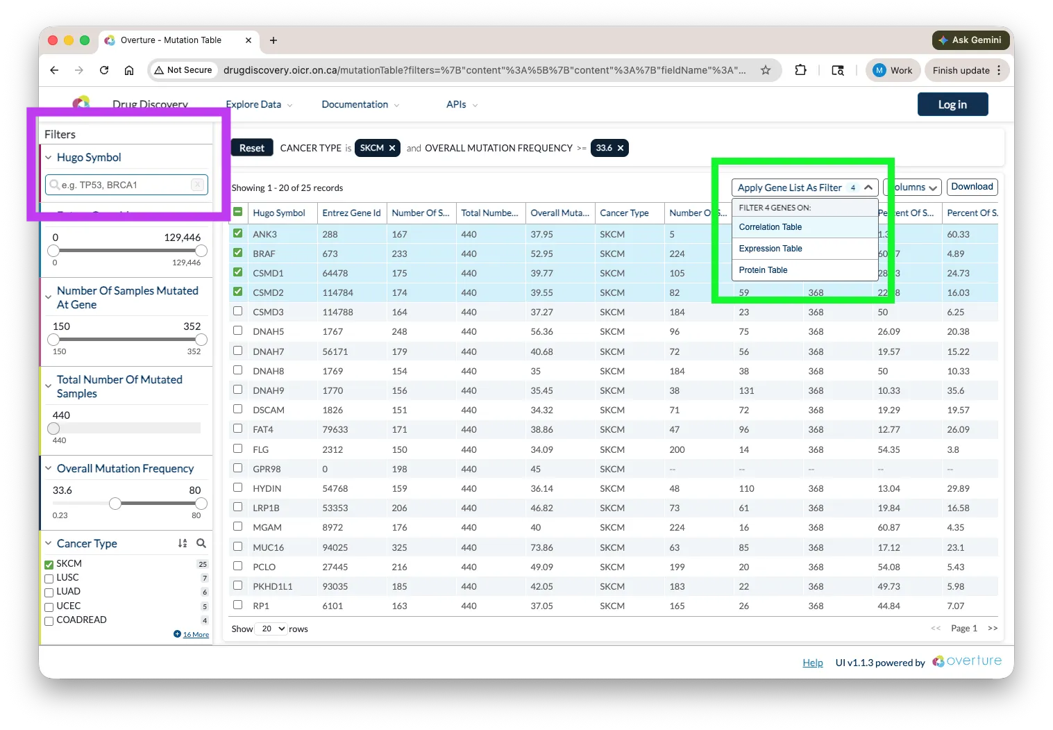
Cross-table search (green box) allows a selection made in one data table to propagate as a filter in another, using a shared identifier across heterogeneous datasets. For example, selecting a gene in one table can automatically filter a second table to show only records that share that gene. This is particularly useful for multi-omics or linked clinical and molecular datasets.
Both features require configuration beyond the scope of this workshop. Reach out via contact@overture.bio if you'd like guidance on either.
Checkpoint
At this point you should understand:
- Where to change the portal name (
NEXT_PUBLIC_LAB_NAMEindocker-compose.yml) - Where to replace the logo and favicon (
apps/stage/public/images/) - Where theme colors and fonts are defined (
apps/stage/components/theme/) - That adding a new data table requires a component, a page route, environment variables, and an Arranger service
Extension Task: If you have time or want to go further, the Extension Task introduces schema-validated data submission using Lectern and Lyric, useful if your data is hierarchical or requires enforced data quality before it reaches the portal.